Basic Grey
futuristic/colorful/urban
reminds me of darth vader
basic w/glowing lights
futuristic/color/urban/i don't know
Playful/kid-like
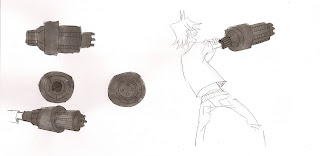
Here's a more completed image to REALLY see what the gun looks like more clearly.
Finished thumbnailing my new storyboard. I'll be fixing it up and posting it later.
QUESTION: How polished are visdev/designs supposed to be? are these sketches not polished enough? What is considered presentable in the pre-production world? I want my work to look good, but I want to work fast and efficiently, so I don't want to waste time on refining every little thing. In the actual film, I would probably clean up my lines more, but here I've just scribbled. Should I be cleaning them up?


Diana, in the "Pre-Production World" you would want to avoid the "sketchy" look unless that is the look you are going for. You will need to clean up the artwork (you just need two or three drawings) demonstrating the final polished look.
ReplyDeletePersonally, I think the orange gun is scariest!
Hey Diana!
ReplyDeleteI think for your student film though these are really nice. Especially the one with the guy holding it. I am a fan of the gray and blue myself. I plan on using something similar in my film. The gun looks great by the way :)